
Start Date: August 19th
Project: Help a newly launched app optimize their user experience and increase usability.
Value Proposition: A pay-per-view service that allows broadcasters to directly monetize their content and a platform for fans to get one-on-one experiences with people they follow.
Goal: Deeply understanding current site/app, current experiences, and business needs.
I began with auditing the existing services and creating a story board for both the broadcaster experience and the viewer experience in order to deliver a design.
I worked with the stakeholders to identify assumptions. It turns out that little competitor research had been done or customer discovery. So we started there.
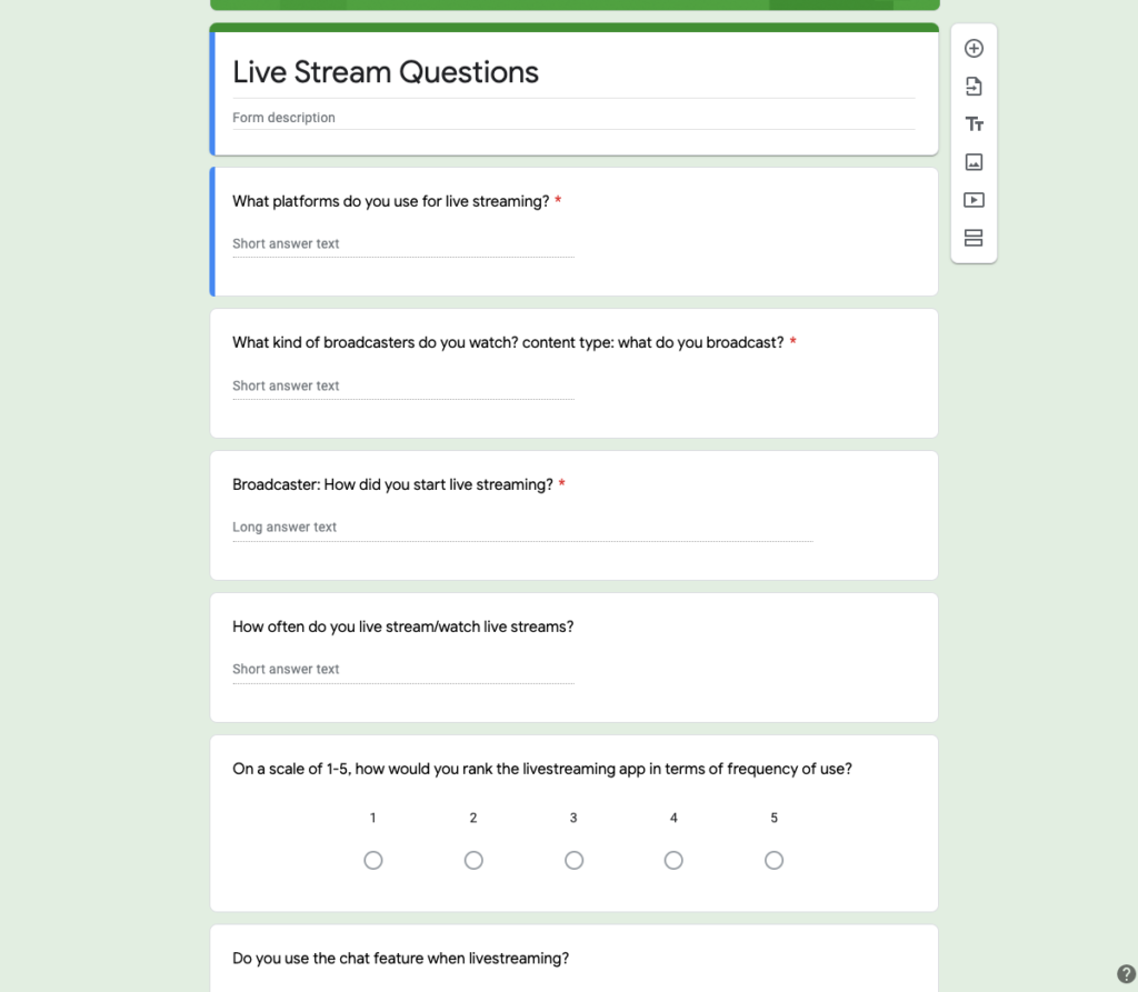
This image is a screenshot of our 30 min interview scripts with live streaming users.
We took the existing research and interviews, and as we dissected them, together we identified themes and began ideation. I value ideation sessions. I have a number of UX best practice workshops to draw upon. With this team, one of the largest disconnects was the overall direction of the product. I user “How might we” ideation to bring the team around a cohesive vision.
All of the team had slightly different vision statements, but with the methods of “note and vote” and “how might we statements”.
Together we created over 50 HMW statements and voted on the ones that were most important for this product. The final How Might We statement that we chose was…
How might we make a platform that broadcasters can join seamlessly?
We also were able to convene on a one year goal.
In one years time, we would like to have 200 broadcasters that broadcast at least once a month.
This exercise is valuable because it keeps the focus on the value to the user. Often we want to jump to solutions and articulate to our team how awesome those solutions are. Many people are not testing their assumptions early enough with users.
Shortening feedback cycles is my strength in guiding companies towards product-market fit.
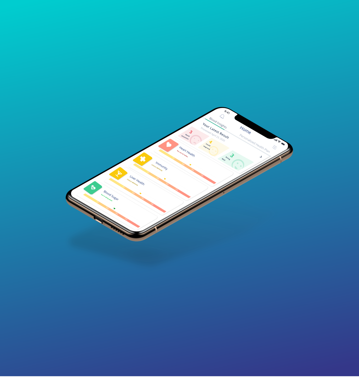
Currently the main value proposition of the app is that they offer a way for content creators to have a direct line of payment with their viewers.
However, currently it takes about 10 steps for a user to complete a payment. My goal is to turn that into way less.
Currently there isn’t a direct line for broadcasters to sign up on the website. Broadcasters are manually curated and invited to join by the leadership team.
From the story boarding, I could see two very important red routes for the user. The moment when the user first hears about the broadcast from their star, and when the user returns to the app in order to access the broadcast.
The current steps for both of these procedures are arduous and one step does not direct the user to the next. These are light and early suggestions I quickly designed in proto.io.
This design suggests creating a page on the website that broadcasters can share on their Instagram. This link will directly move users through the payment, and take their account information as they pay.
Currently the app does not have a notification system set up and it is very important that users get reminders for paid scheduled broadcasts.
I worked in sprint cycles with deliverables of designs and user interviews each week. I tested usability with clear ranking of success on tasks, but also took qualitative data with interviews and questions. I was able to draw upon key ideas and feedback that I wouldn’t have been able to see on my own. This feedback drove design and ultimately the client was very happy with the product.