• Client

    Financial Innovation Network
  • Role

    User Experience Designer
  • Year

    2020
  • Platforms

    Web
  • Project URL

    https://www.figma.com/proto/e94ov3ZGviNLqepRznHWji/FIN-V1.6?node-id=345%3A310&scaling=min-zoom

Overview

Objective  - Improve the angel investing experience for founders and investors. ‍
Purpose of the project  - De-risk direction by user research. Discover opportunities and define target problem space. Design and prototype high fidelity experience. ‍
Mentor - Mark Koester, Product Manager and Engineer ‍
‍My role  -  Lead UX researcher, UX designer and UI designer. On my design team, I had one intern, Leo Peng, who led competitor research. ‍
‍Challenge - How to design a trustworthy platform that can aid in such high stake decisions? In a crowded market place, with extensive CRM tools, how might we solve a problem that remains? ‍
‍Final product showcase  - Hi-Fidelity, clickable, responsive, and development-ready prototype for a range of screen sizes.

Why Focus on the Investment Space?

We hypothesized that there was space to improve this experience for both founders and investors. We found more direction in what problem space to focus on specifically through user interviews. In short, founders find it incredibly difficult to find funding unless you have a wealthy network. On the other hand, more and more small scale investors are looking for investing small percentages of their portfolio in high risk early stage companies. We hope to possibly utilize the data collected on the platform to create funding prediction intelligence down the road.

Customer Discovery and Research

I created a feeder survey and research questions for interviews based on ideation exercises together, where I led stakeholders to identify all critical assumptions. We had two early personas based on these assumptions, and we chose to focus on them in two independent research sprints.

We spoke with 10 users, 5 from our founder target audience and 5 from our investor target audience. We focused on general non-leading questions to see if users would offer problems that they face.


Assumption Identification and Testing Plan

Image of ideation and voting workspace. Miro was the tool used to go about documenting assumptions in order to create interview questions.


User Interviews

We sought out and spoke to our target users in order to understand our target problem space. We submitted reports for each persona with transcipts as well as highlighted quotes, themes, and mapping against assumptions. The outcome of these interviews were: personas, empathy maps, a report, and user stories.


The following video is an interview conducted with a target user in our Founder persona.


Personas


The personas evolved around ongoing interviews, research, and even prototype testings. Having a persona helped us drive product decisions based on the needs of the user rather than the intuition of the top stakeholder.


Image of target founder persona.


Empathy Maps

Understanding our users environment can help understand where our product ultimately fits in with the lives of our target users. We took key quotes to infer a broader picture of their experience in the startup space.

The following image is one of our empathy maps.


Designing Solutions

With a defined problem space, clear ideas from the users, and agreement on direction, we began designing the experience. The main problem space is described in the quote below. We aim to only build features that solve real user problems and validate all design decisions with user testing.

“We curated our VC list by hand. We put a good number of hours in trying to cultivate a list of the ones of the right VCs and angels to approach. But ultimately, we weren't even ready to seek funding at all. I wish we would have just used those three months of work on building product.” - David Coonin, Head of Growth, Productify


Sprint Cycles

As a freelancer and consultant, it's crucial that I show work to my clients each cycle. I love the book Sprint, and it's a great slice of knowledge in the UX space that has really empowered me to feel confident in my practice of design thinking. I start each week with ideation, and end with a high fidelity prototype. I usually schedule a few user tests on Friday that I can do within my day.


Wireframing

We strategized a theme framework that allowed our designers to create beautifully accessible templates, while baking in enough flexibility to allow merchants to customize the experience for their industry. Site Builder extends the administrative experience, separating content into blocks and allowing for a custom but controlled end product.


Final Prototype

Due to NDA, I am not able to share specific designs. This product is in the stage of being coded and will be hitting market at the end of this year. My work involved bringing then design from low fidelity to high fidelity, exploring various features during sprint cycles, and validating usability with user tests.

Usability Testing

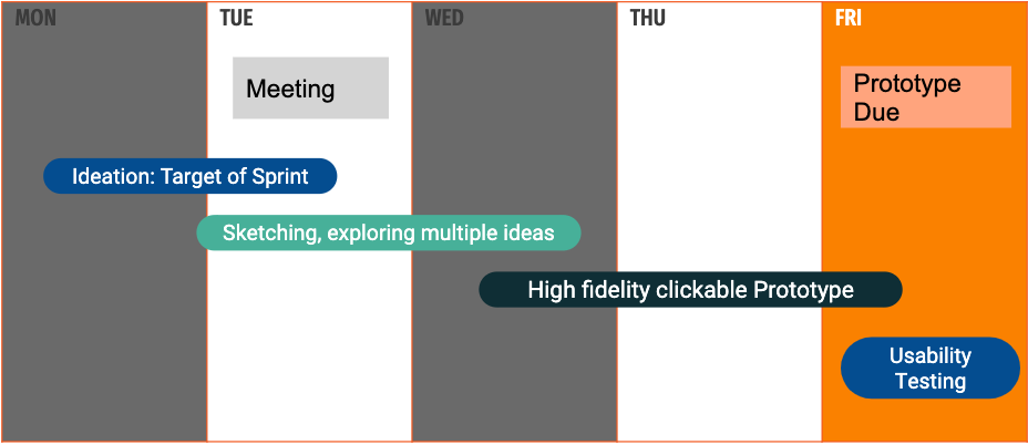
We conducted usability tests following each design sprint.


A usability test is intended to determine the extent an interface facilitates a user’s ability to complete target tasks. Sessions are recorded and analyzed to identify potential areas for improvement to the product. During the test and after, users are asked a series of questions to confirm their understanding. 


We aimed to evaluate our design decisions by:

  1. Testing the product experience 
  2. Evaluating ease of jobs-to-be-done with target users.
  3. Reveal points of friction and confusing experiences.
  4. Identify bugs and issues with the product.


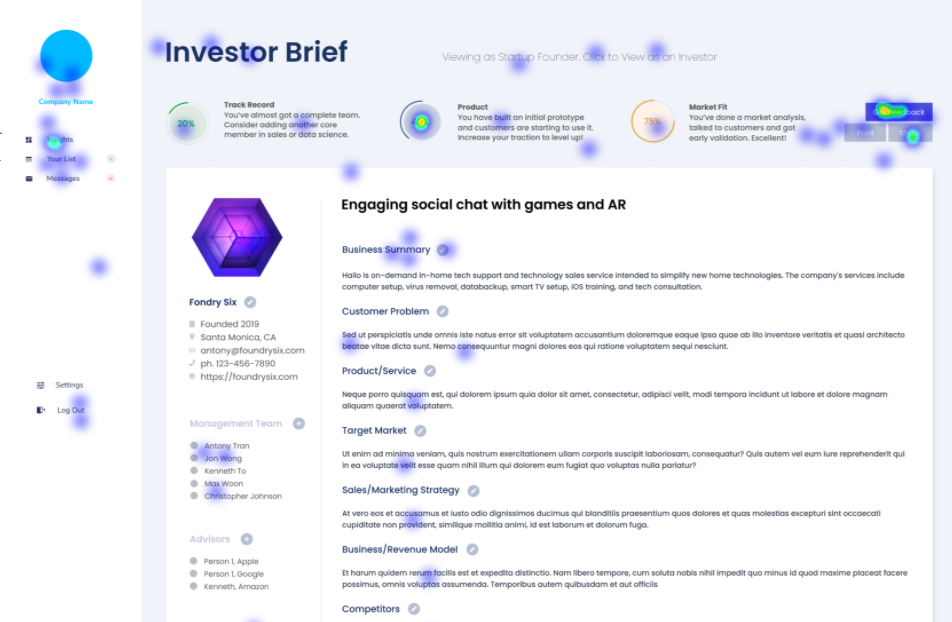
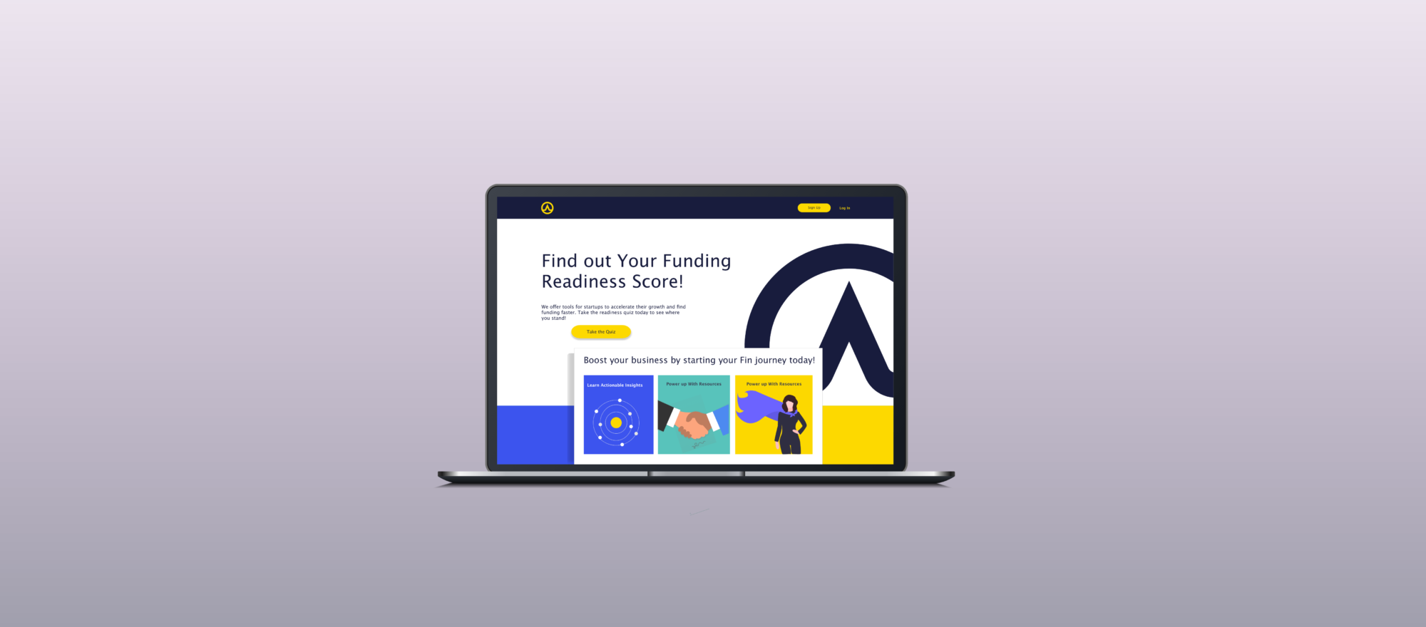
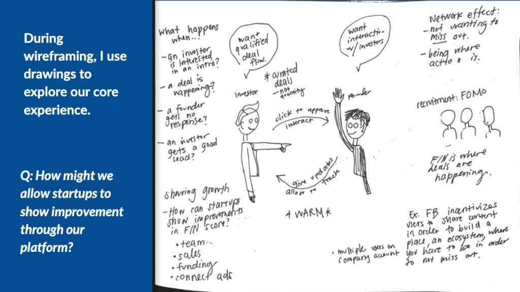
In the following image, we can tell where users are clicking. Users are given specific tasks that we intend them to do on the page, while also having the opportunity for feedback. This feedback drives future design iterations.


Dev Hand Off

Finally, I create a development hand off document, which ended up being 25 pages long, clarifying all user stories. Additionally, all the designs have developer inspection for each element, where the elements are translated into CSS and HTML code.


During development, the UX feedback cycles are paused while we accelerate to get an MVP to market. But user-centric pivots are never really complete. The process of gaining feedback from users continues after this build period.