
This company had focused their product roadmap deeply on data labeling tools, they had never optimized use of the overall platform from a user experience perspective. The dashboard was full of endless options, leaving users confused and struggling to complete simple tasks.
This platform was designed by developers and had an overwhelming and unclear interface. My role began with understanding the problems of the users and services, then completing a series of sprints, each focusing on solving a different pain point.
I began my proposal to Basic Ai with a heuristic review. I recruited an Ai data scientist to go through the platform and observed his pain points in correlation with Nielson’s 10 general principles for interaction design.
Excerpt from Usability Heuristic Review:
My presentation was received well. I presented a proposal of an eight-week redesign project. I began working full time with this client almost immediately following the proposal.
Phase 1: Finding the Right Problems to Focus On
Discovery is a crucial step in any UX endeavor. Especially so in this case. I’ve worked with many clients that are in the early stages of defining their product.
In this case, more than 5,000 employees and clients depend on this software-as-as-service (SAAS) system. As an outsider, any proposed changes would be useless without a deep understanding of the users and the platform in its existing form. I spent one week of full-time work in the discovery phase to understand existing problems, align with the vision moving forward, and define who the users are that I will be designing for.
I did a number of stakeholder interviews, documented each existing page of the platform in detail and decoded numerous functionalities all to get at the core of their service blueprint and user journey.
I thought about different users that are currently using the services. I talked with people from Sales, from Marketing, and top leadership to narrow in on the persona of focus. This persona guided my target audience for user tests and was a focus throughout designing the new system.
Fully managed multi-tenant Saas (Cloud instance) ~Most clients have 1 project at a time
Top Persona Tasks

Due to the nature of this client, my role was very much to evaluate the overall efficiency of the system in relation to both users’ needs as well as the investment of human resources to meet those needs. Rather than focusing solely on the features associated with the users’ journey, a service blueprint was necessary to map the full spectrum of work done for each step. I found significant friction in this process.
The onboarding of a new customer begins with an extensive email exchange, and before the customer can even get a price quote, they must nearly 5 internal touchpoints, including sending the data to an external team in China for processing. It became clear that my role was to improve the client’s capacities within the platform in order to save time, money, and energy for both the internal team and external customer.

Ideation is a great chance to get buy-in from your team through understanding their pain points and documenting their vision. We began our visioning workshop with an overview of findings from the discovery phase as well as watching some clips from the recorded user tests together as a team.
After reviewing the service map together, we rewrote the key points of the user journey on sticky notes. Each stakeholder had their own sticky notes to post pain points under each aspect of the user journey.
We found several themes in pain points. These themes were crucial in breaking down what design work I would focus on for each of our seven sprints.
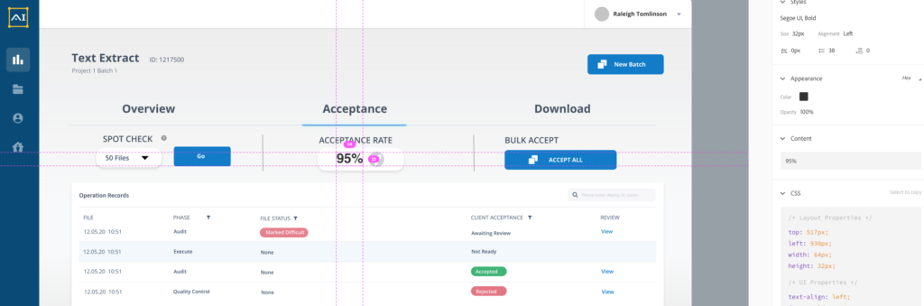
We focused on different features of the product for each sprint. So far I have completed 4 weeks of sprints, and am about to begin on the 5th week. I have focused on key features to improve the entry point for users from embedding pricing into the project creation flow to improving the ability for users to define requirements for projects.
I gained insight from user testing and stakeholder reviews, iterating on the existing build. Each version also had a new focus and addition as well.
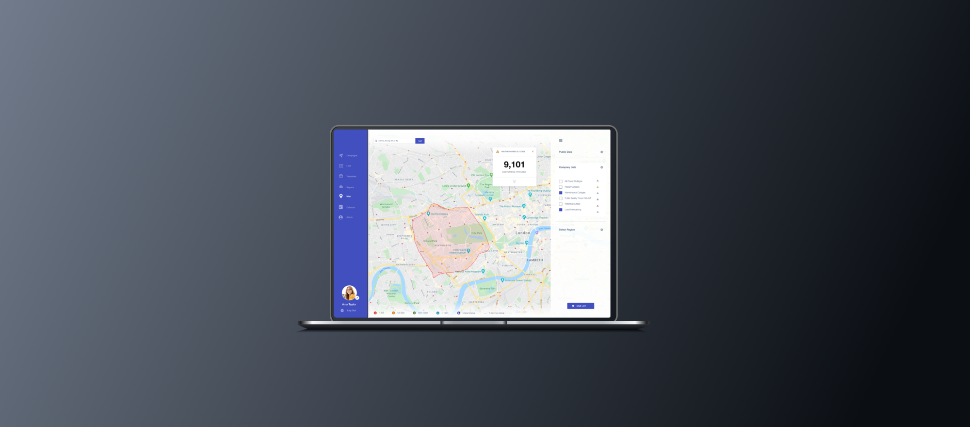
The call to action to create a new project is important here. The user needs key information regarding oversight of their running projects. We added Alerts and the ability to send a message to our team as well.
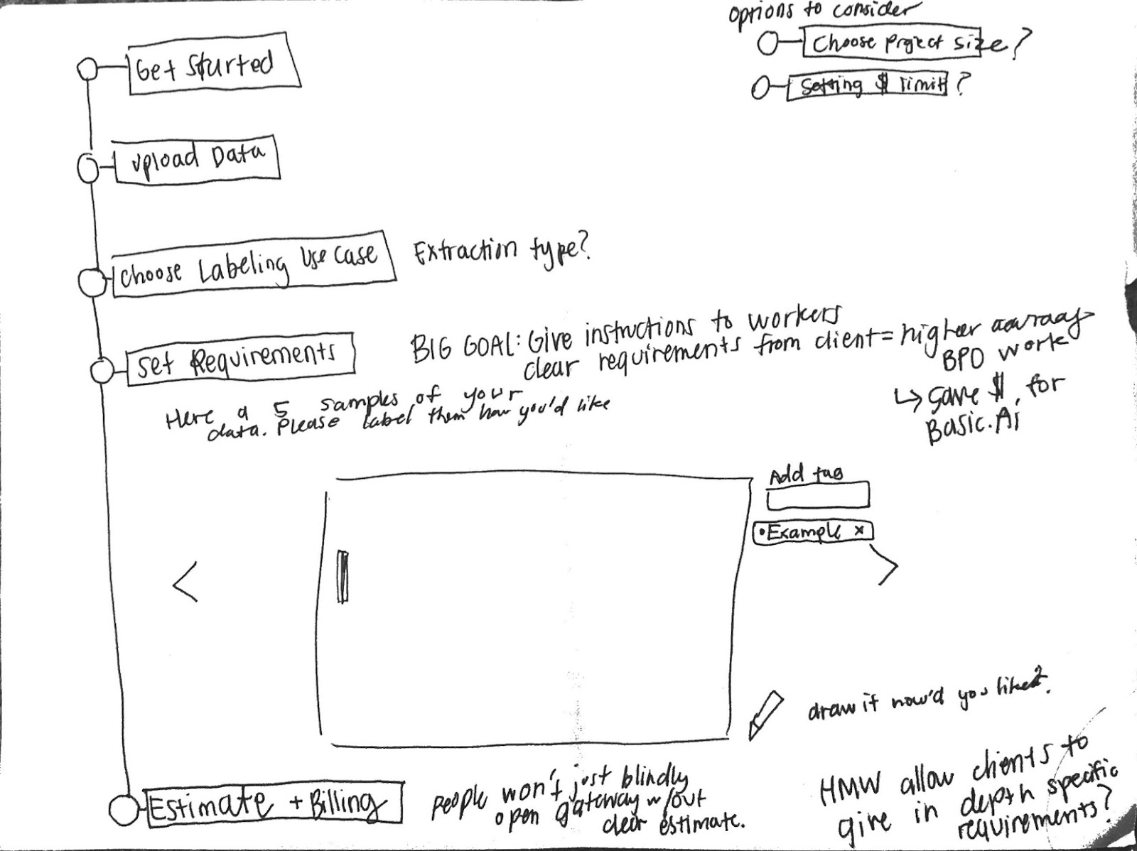
Low to High fidelity examples:


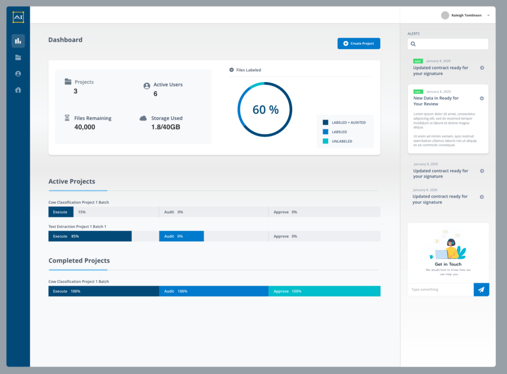
This is the most important focus of the work I did. Currently, the existing platform does not have a clear way to initiate a new project. Clients were beginning projects over email before receiving any tenant space or access to the platform. This flow was important to the scalability of this company as a SaaS product. We spent time discovering the existing pain points in defining requirements and created a new experience.

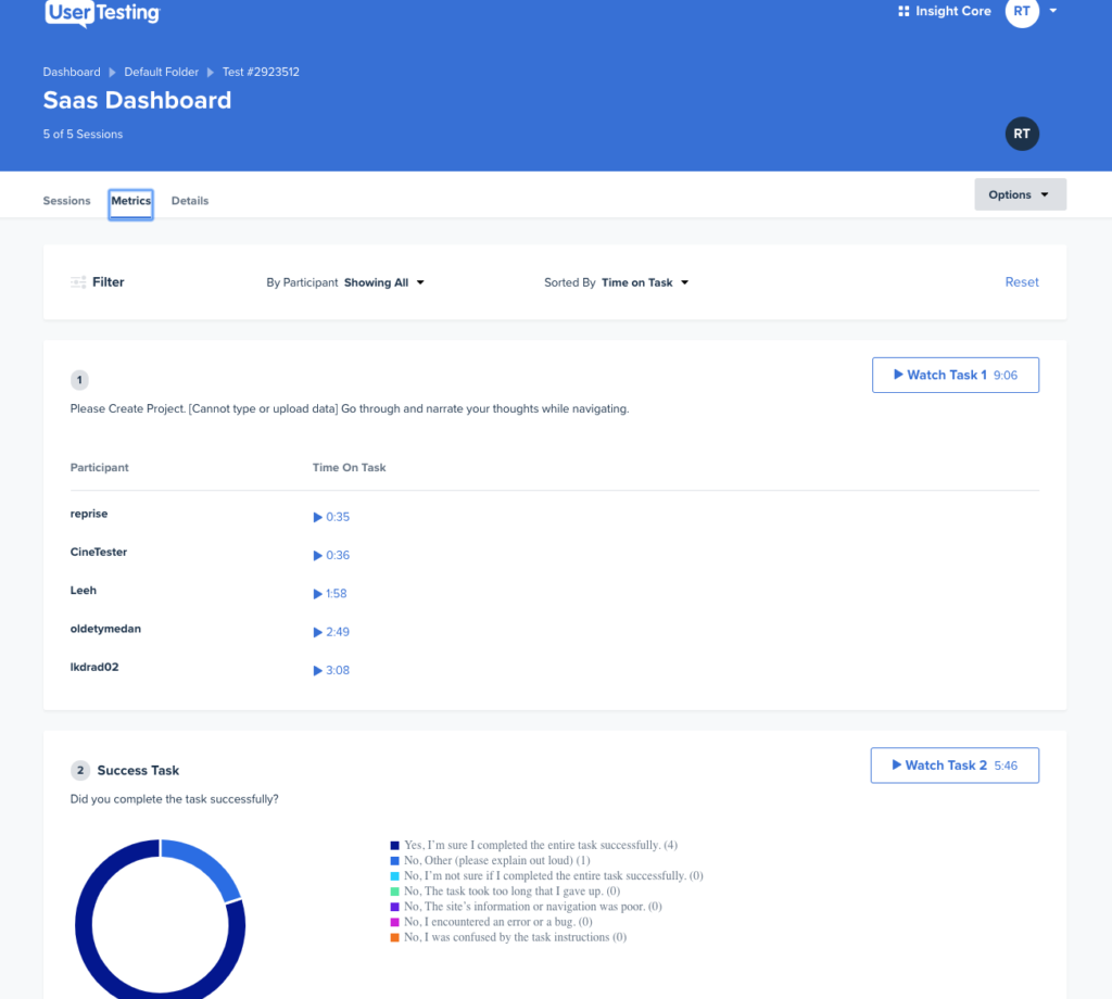
Completing user tests with each sprint allows me to validate that my designs are in fact usable.
In the past, all of my user testing has been through guerilla research. But for the purposes of this project, it was valuable to do remote testing through UserTesting.com. I still did my initial user tests through connections. I knew a few data scientists that were willing participants. But with the remote tests, I was able to get objective results that I could I was able to quantify easily. I was able to show my stakeholders feedback on my own designs with video highlight reels and clear usability feedback.
The development team that this company uses is located in China. So I completed the design phase in separation from the team that would be implementing the designs. I created in-depth documentation of the features, outlining what each aspect of the UI was intended to do, and offering API microservice recommendations for a few cases.
I began the handoff with using Zeplin, but it would have been difficult to get in the hands of the developers because I would have to grant permissions on a person-to-person basis. Our development team is located in China, and I wouldn’t be able to communicate with them directly. But actually I found that AdobeXD had a much better developer inspection view that offered the same benefits of Zeplin, but I could share publically. I was so happy to discover this feature.
I was happy with my ability to stay in discovery long enough to truly understand the product, and I based all of my sprints around user and stakeholder identified pain points.
I learned a lot about AI from my engineer peers, from understanding this user persona in-depth, and from getting the chance to think deeply in this problem space.
Most of my experience in the past was on mobile applications and web apps, so this dashboard SaaS product was a new space for me. I utilized some new tools in this process, such as remote user testing, new developer tools, and creating documentation for development.
This was my first time taking on a freelance project full time, and I realized the value of that. I felt that my stakeholders appreciated how fully committed I was to solve their problems. This is currently the project that I am most proud of in my portfolio.
Thanks for reading! You can visit my medium to check out some of my other writing as well https://medium.com/@tomlinson.raleigh/my-journey-designing-an-ai-software-product-2ec0dc843a35
Walking in to my first day with three user tests under my belt, I began the journey of uncovering what problems to focus on with deeply understanding the platform in its current state. On point of reflections was user tests, but a second was reviewing documentation, and creating my own.